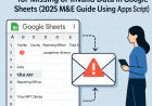
Building Real-Time Dashboards with Google Sheets & Apps Script for Health Facilities
Create real-time performance dashboards for health facilities without coding. Learn how to pull data from KHIS/DHIS2 APIs, display metrics with conditional formatting, and share via Google Sheets.
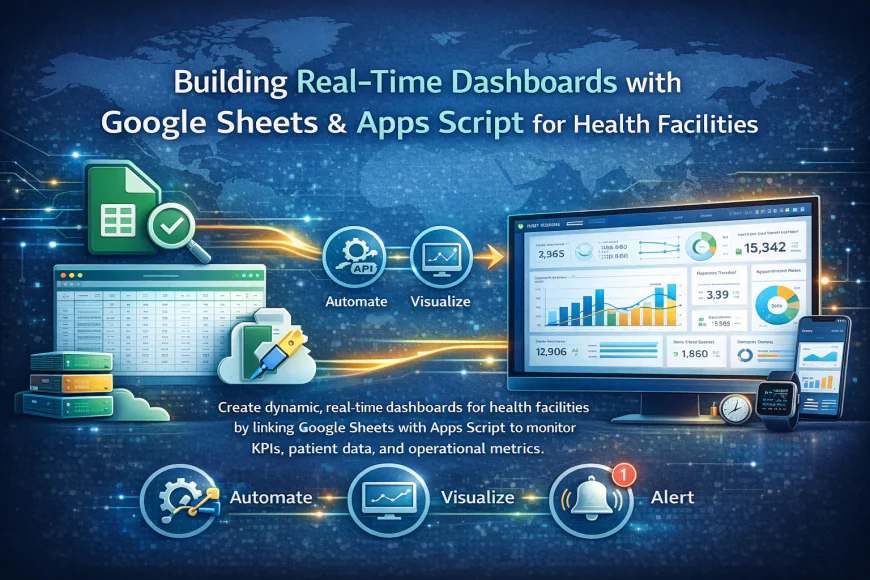
Learn to build professional dashboards that display live facility performance data. This tutorial covers:
1. Connecting Google Sheets to KHIS/DHIS2 APIs
2. Creating conditional formatting rules for alerts
3. Designing mobile-friendly dashboards
4. Sharing with restricted access
Key Features:
- Real-time data updates every 15 minutes
- Color-coded performance indicators
- Multi-facility comparison views
- Automated email alerts for KPIs
Why Real-Time Dashboards Matter for Health Programs
Health facility managers struggle with delayed reporting. By the time monthly reports are compiled and analyzed, the opportunities to respond quickly have often passed. Real-time dashboards change this dynamic entirely. Your managers can see what's happening right now - not yesterday's data.
With this approach, you gain immediate visibility into which facilities are performing well and which need support, whether critical indicators are trending up or down, which programs require urgent attention, and how your health outcomes compare across regions.
The traditional approach meant waiting for IT staff to generate custom reports. This tutorial shows you how health program managers can build their own dashboards without any coding knowledge.
Getting Started with Your First Dashboard
Before you start, make sure you have access to your KHIS or DHIS2 instance with API credentials, a Google account for creating Google Sheets, basic familiarity with spreadsheet formulas, and permission from your system administrator to access health data APIs. The setup process takes about 30 minutes once you have these credentials in place.
Connecting Your Data Source
Google Sheets can pull data directly from your KHIS or DHIS2 APIs using a simple formula. This creates a live connection - whenever data updates in your health system, it automatically refreshes in your dashboard.
You don't need to copy and paste data manually. The API connection handles everything, pulling the latest information on your schedule. Many facilities set this to update every 15 or 30 minutes. One common concern we hear is whether this will slow down your health system. The answer is no. API queries use minimal server resources.
Formatting for Impact
A dashboard is only useful if people can understand it at a glance. That's why conditional formatting matters. You can set up rules so that red cells appear when targets are missed, green cells show when targets are exceeded, and yellow highlights borderline performance. This visual approach helps managers spot problems immediately without reading through columns of numbers.
Making Dashboards Mobile-Friendly
Not everyone accesses dashboards from a computer. Health workers in the field need mobile-friendly versions. Google Sheets automatically responds to different screen sizes. You should still design with mobile in mind by using fewer columns so data fits on small screens, prioritizing the most critical metrics at the top, and creating separate sheets for different user roles.
Securing Your Dashboard
Health data is sensitive. Google Sheets allows you to share with specific email addresses, grant different permission levels like view only or edit, restrict access by organization, and revoke access instantly if someone leaves. Best practice is to create viewer-only access for most users and only allow editing for designated dashboard managers.
Automatic Alerts Keep You Informed
You don't want to check the dashboard constantly. Instead, set up automated email alerts. When a critical threshold is crossed - like immunization coverage dropping below target - you get notified automatically. Apps Script can trigger emails based on specific data thresholds, percentage changes day-over-day, missed deadlines, or unusual patterns in the data.
Moving Beyond Basic Dashboards
Once you're comfortable with the basics, you can add predictive indicators showing which facilities will miss targets, create drill-down views where you click a region to see facility details, integrate data from multiple health programs, and export data automatically for district reviews. The skills you learn transfer to other projects too.
What's Your Reaction?
 Like
0
Like
0
 Dislike
0
Dislike
0
 Love
0
Love
0
 Funny
0
Funny
0
 Wow
0
Wow
0
 Sad
0
Sad
0
 Angry
0
Angry
0


Comments (0)